St. Moritz became our most iterated stamp in this release window. This post now shows real screenshot snapshots for each phase and explains exactly how the design language evolved toward a Swiss vintage tourism-poster look.
Why this destination needed extra focus
St. Moritz is one of the most iconic alpine destinations in the catalog.
The stamp has to read clearly at small mobile sizes.
We needed motion and realism without losing the collectible stamp identity.
Evolution screenshots
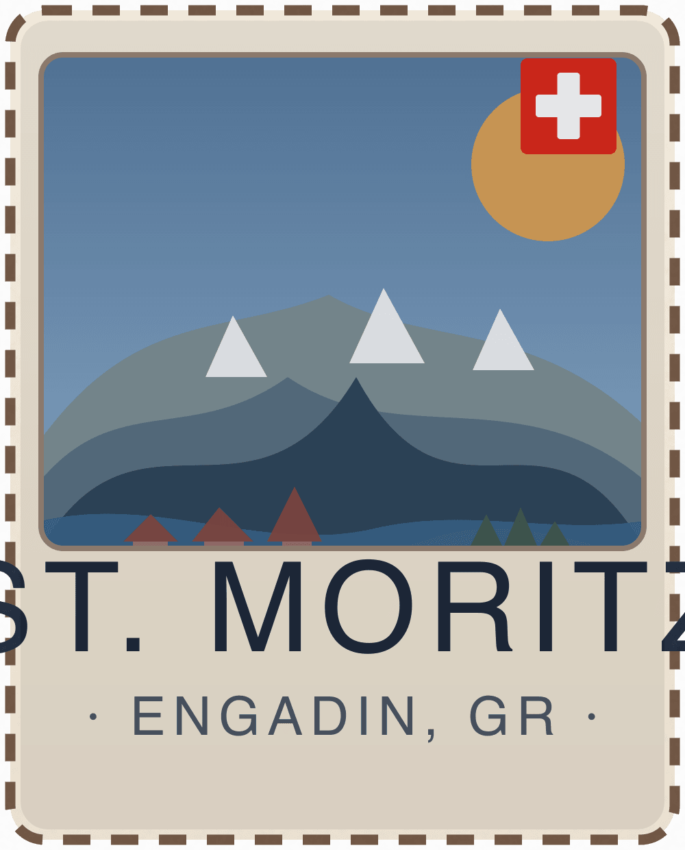
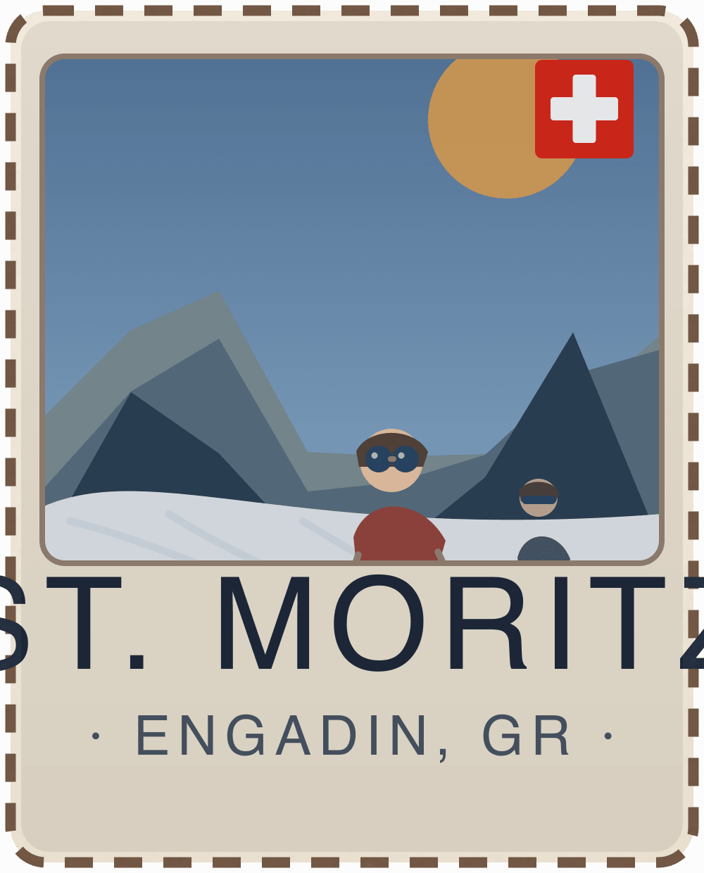
V101 — base scenic reset
St. Moritz V101
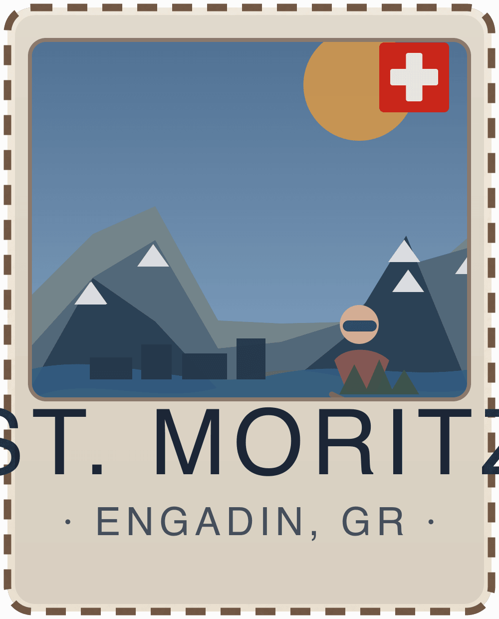
V1.0.2 — stronger alpine massing
St. Moritz V1.0.2
V1.0.3 — scene simplification and cleanup
St. Moritz V1.0.3
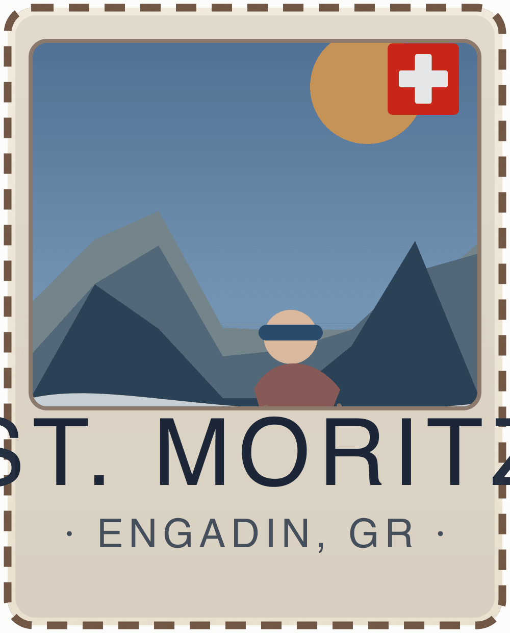
V1.0.3a — deeper vintage atmosphere
St. Moritz V1.0.3a
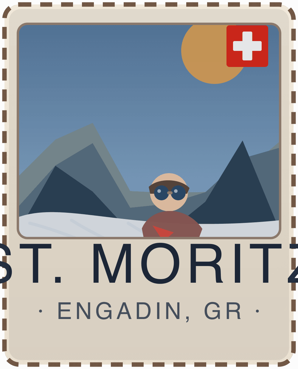
V1.0.3b — skier + snowboarder realism pass
St. Moritz V1.0.3b
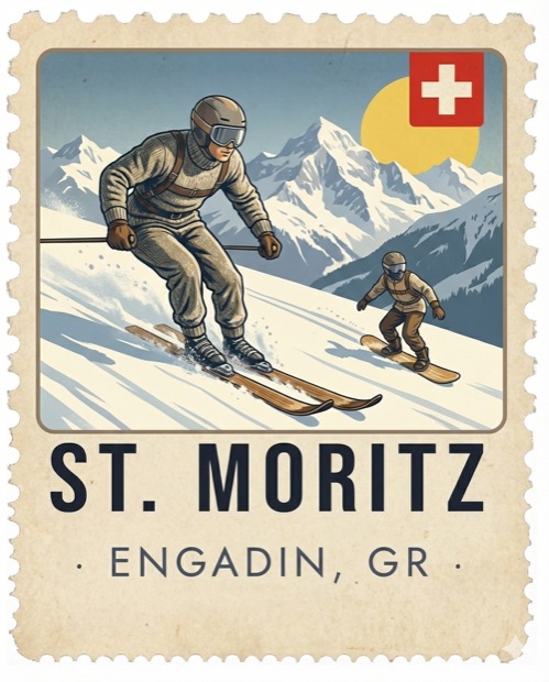
V1.0.4 — curated final artwork (compressed production asset)
St. Moritz V1.0.4
Design language evolution (what changed and why)
1) Composition hierarchy
Early versions spread attention across too many shapes.
Final direction uses one dominant foreground skier and one smaller background rider.
Result: instant readability and better visual storytelling.
2) Alpine silhouette and depth
Mountain forms were enlarged and layered to create stronger place identity.
Slope lines now drive eye direction from foreground to background.
Result: clearer high-alpine feel even at small stamp scale.
3) Vintage Swiss poster cues
Palette moved toward warm paper + controlled red/blue contrasts.
Texture/noise stayed subtle so the image still feels printed, not flat vector.
Result: more authentic retro-tourism character.
4) Realism without clutter
Gear details (helmet, goggles, skis/snowboard) were increased where it matters.
Secondary elements stay smaller and lower contrast.
Result: believable winter sports scene without visual noise.
5) System consistency
St. Moritz is now a curated raster asset for quality control.
Other destinations can stay procedural unless they need hero-level treatment.
Result: scalable stamp system with selective premium overrides.
Technical delivery notes
Source image: stmoritz.png
Production asset: /public/stamps/stmoritz-vintage.jpg
Renderer override: St. Moritz route in DestinationStamp now uses the optimized image path directly.
This post is now the reference for how we evaluate future hero destination stamp upgrades: stronger subject hierarchy, destination-specific cues, and vintage poster coherence first.